Role: I led the design of an enhanced executor experience to address usability gaps in workflow visibility and orientation for global enterprise teams. The project was initiated after discovery sessions with key clients, including Telefónica, Essex Brownell, and Ocorian, and aimed to provide clarity for both light users and colleagues while maintaining control for admins.
My role was to translate complex technical requirements into an intuitive user experience that balances visibility, simplicity, and actionable clarity.
Problem Statement
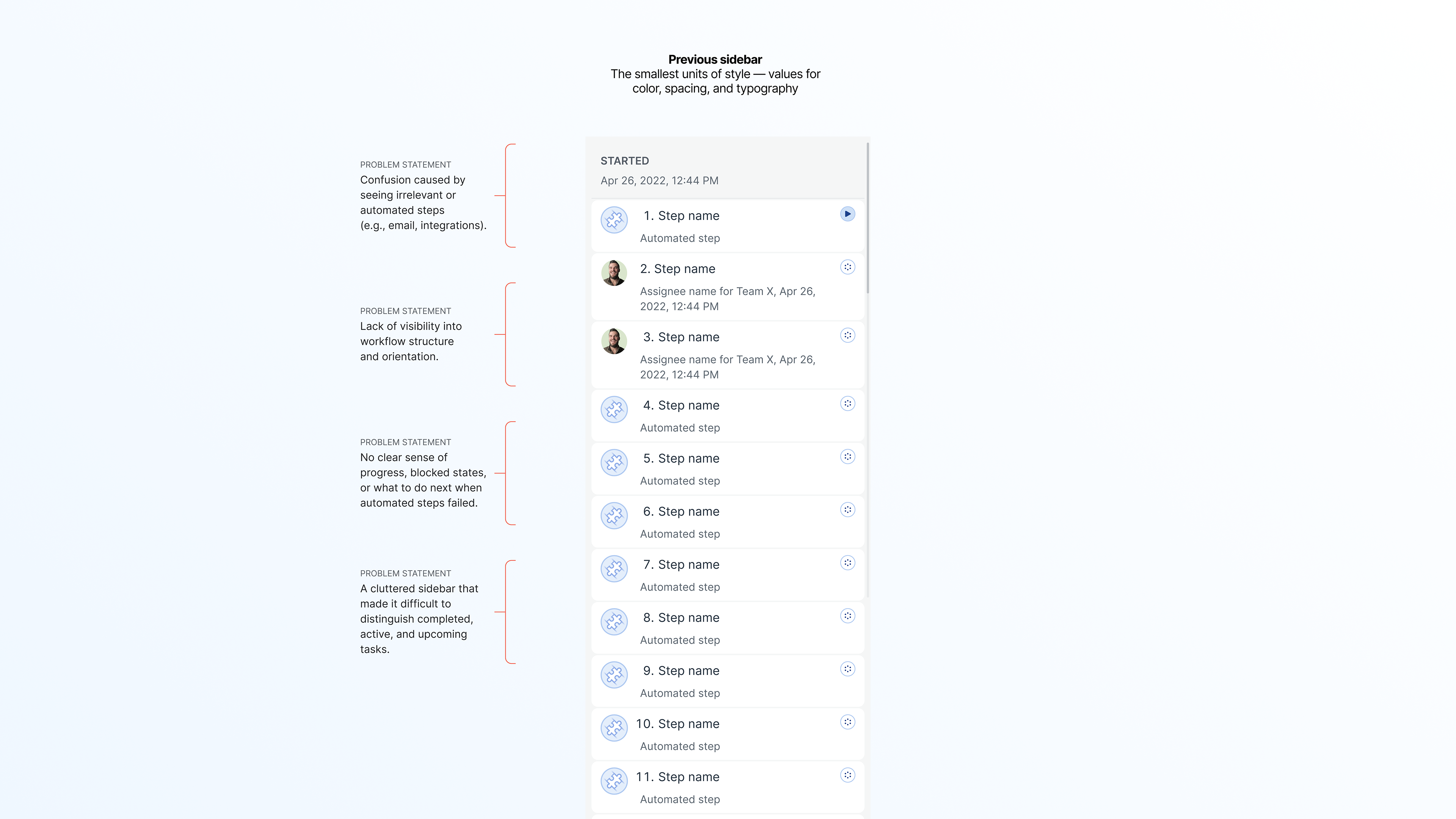
Executors — users responsible for carrying out workflow steps — struggled with:
• Lack of visibility into workflow structure and orientation.
• Confusion caused by seeing irrelevant or automated steps (e.g., email, integrations).
• No clear sense of progress, blocked states, or what to do next when automated steps failed.
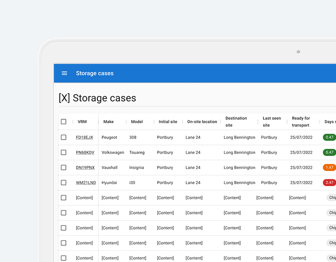
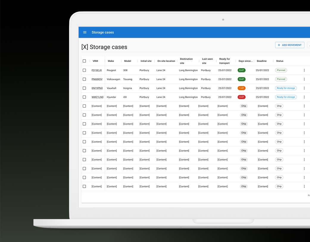
• A cluttered sidebar that made it difficult to distinguish completed, active, and upcoming tasks.
• Lack of visibility into workflow structure and orientation.
• Confusion caused by seeing irrelevant or automated steps (e.g., email, integrations).
• No clear sense of progress, blocked states, or what to do next when automated steps failed.
• A cluttered sidebar that made it difficult to distinguish completed, active, and upcoming tasks.
These issues reduced efficiency, caused unnecessary frustration, and slowed down team-wide adoption of automated workflows.
Process
Discovery & Research
• Conducted internal workshop for team and key stakeholder ideation • Conducted client interviews to uncover pain points across light users, colleagues, and admins.
• Mapped jobs-to-be-done for each role to align visibility rules with real-world needs.
• Mapped jobs-to-be-done for each role to align visibility rules with real-world needs.
Design Principles
• Clarity over complexity: Show only what matters to the user.
• Progressive disclosure: Hide irrelevant or automated steps while surfacing key blockers.
• Orientation by design: Use stages and structure to guide users through workflows.
• Clarity over complexity: Show only what matters to the user.
• Progressive disclosure: Hide irrelevant or automated steps while surfacing key blockers.
• Orientation by design: Use stages and structure to guide users through workflows.
Iteration & Validation
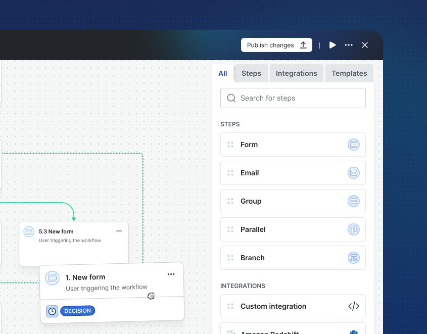
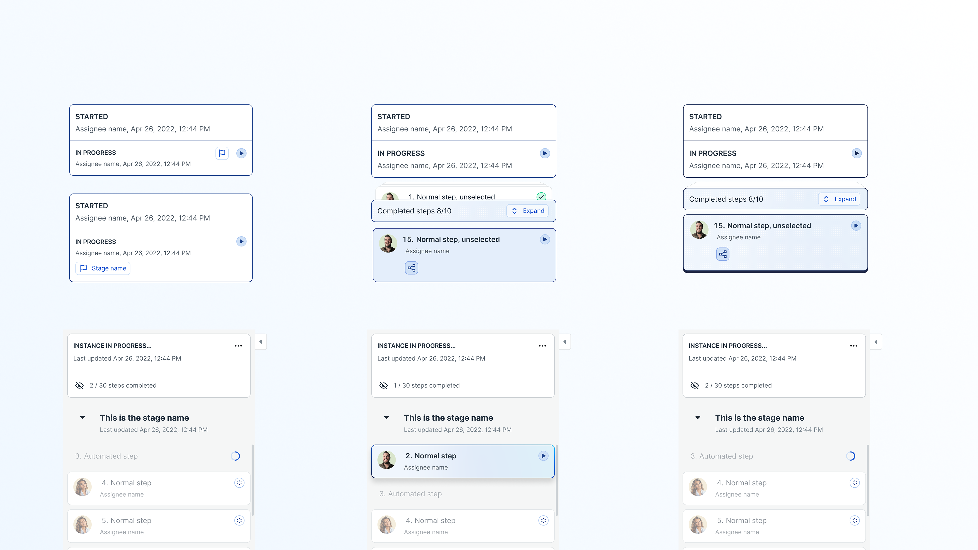
• Prototyped new sidebar navigation with collapsible stages.
• Introduced visibility rules tailored to role-specific needs.
• Tested “waiting/progress” states to help users know when to continue or step away.
• Partnered closely with engineering to align feasibility with backend constraints.
• Prototyped new sidebar navigation with collapsible stages.
• Introduced visibility rules tailored to role-specific needs.
• Tested “waiting/progress” states to help users know when to continue or step away.
• Partnered closely with engineering to align feasibility with backend constraints.
Solution
The redesigned executor experience included:
• Role-based visibility rules: Light users see only their actionable steps, while colleagues see a broader but still filtered view; admins retain full access.
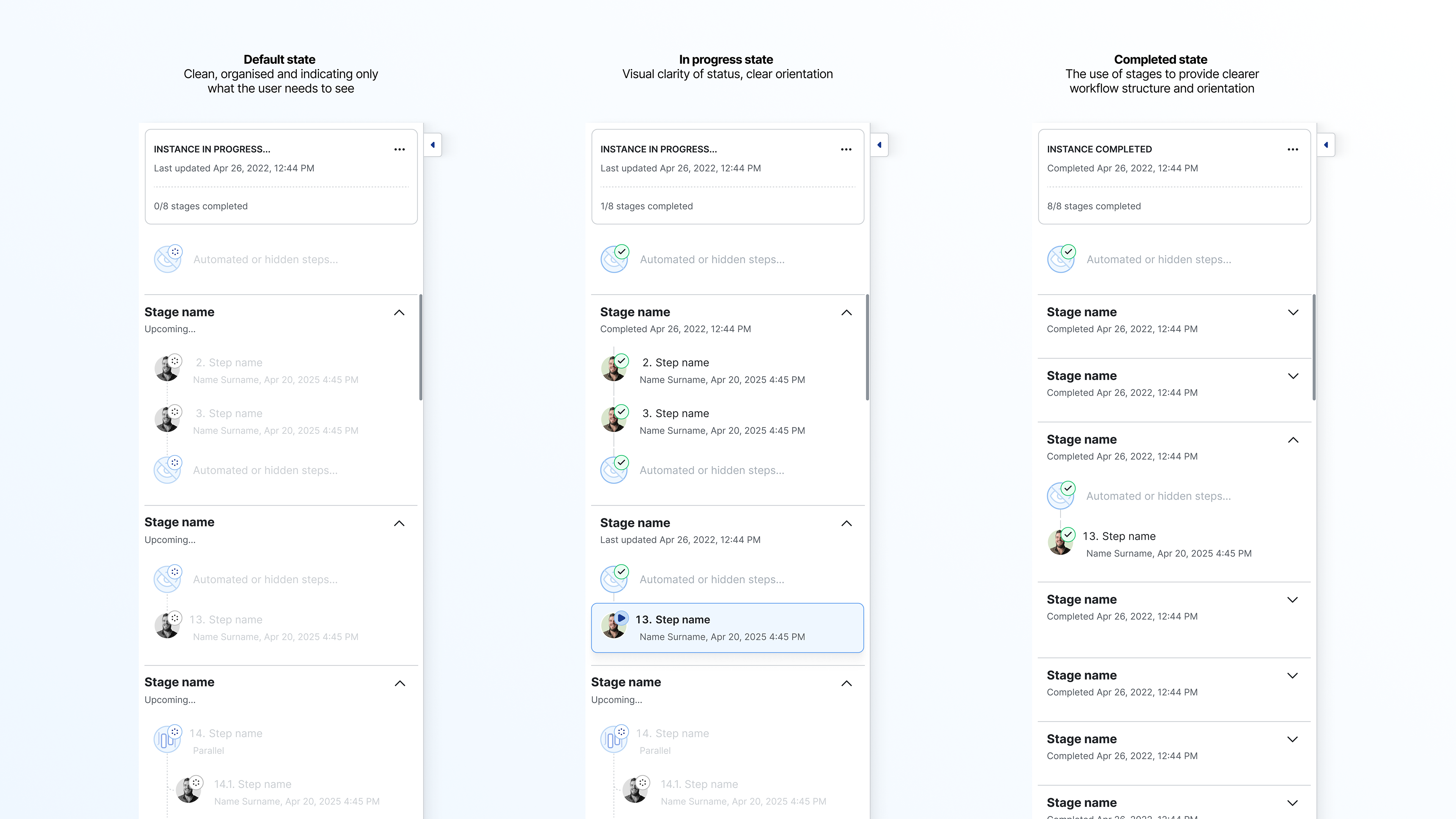
• Decluttered sidebar navigation: Clear markers for completed, active, and upcoming steps.
• Stages as containers: Workflows are structured into phases, collapsed by default except for the active stage.
• Progress & waiting states: Inform users when automated steps (emails, integrations) are running, stuck, or completed.
• Clear exit states: Users are told when they are done and can move on to other tasks.
• Role-based visibility rules: Light users see only their actionable steps, while colleagues see a broader but still filtered view; admins retain full access.
• Decluttered sidebar navigation: Clear markers for completed, active, and upcoming steps.
• Stages as containers: Workflows are structured into phases, collapsed by default except for the active stage.
• Progress & waiting states: Inform users when automated steps (emails, integrations) are running, stuck, or completed.
• Clear exit states: Users are told when they are done and can move on to other tasks.
Show light users only what they need to see
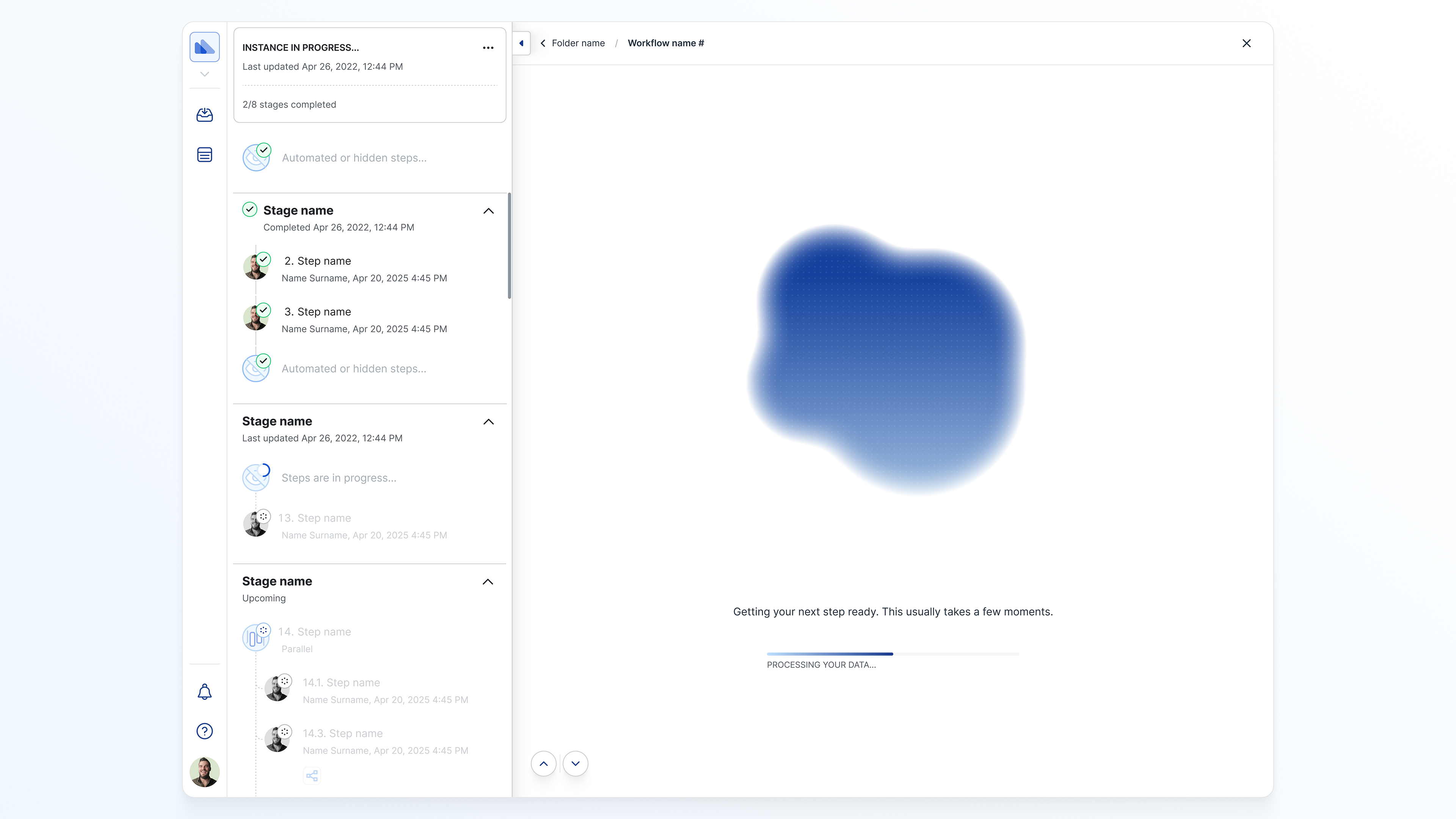
Introduce a meaningful waiting/progress experience for hidden non-human steps (emails and integrations)
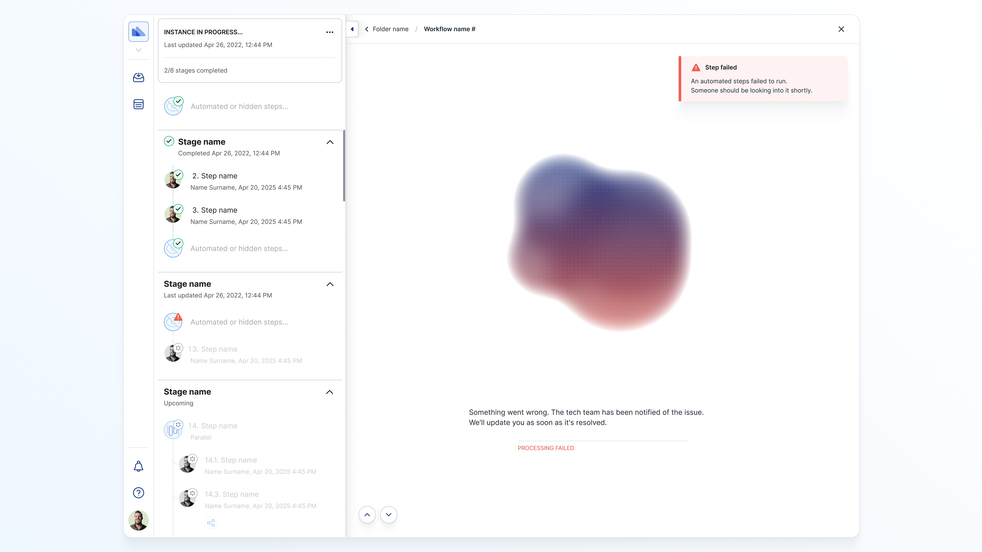
Tell users when something is stuck and what they should do next.
Outcomes
While the feature was in development at the time of this case study, projected outcomes included:
• Improved efficiency for light users by reducing distraction and confusion.
• Higher workflow adoption rates across enterprise clients.
• Reduced support burden from “what do I do next?” inquiries.
• A scalable design framework for handling visibility and orientation across future workflows.
• Improved efficiency for light users by reducing distraction and confusion.
• Higher workflow adoption rates across enterprise clients.
• Reduced support burden from “what do I do next?” inquiries.
• A scalable design framework for handling visibility and orientation across future workflows.
Matter animation